J
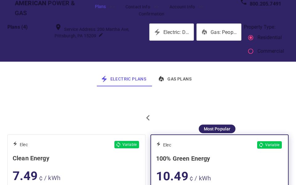
Energy Plans Selection Interface
This MudBlazor e-commerce listing page showcases residential and commercial energy plans in a card-based layout. Uses MudTabs, MudRadioGroup, MudSelect, and MudCard with a selectable plan CTA and breadcrumb-based step navigation.
●
LIVE DEMO
Generated using
Instruct UI - An AI for Blazor UI Generation
Related Showcases
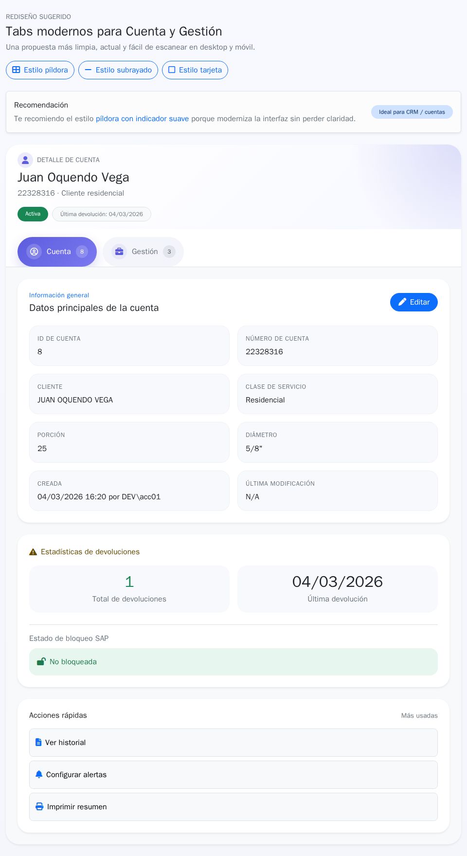
Modern Tab Style Design
By Jose Correa
Bootstrap
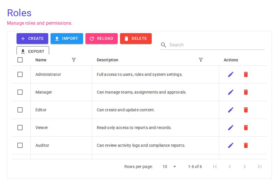
DataGrid Add Button Layout
By
MudBlazor
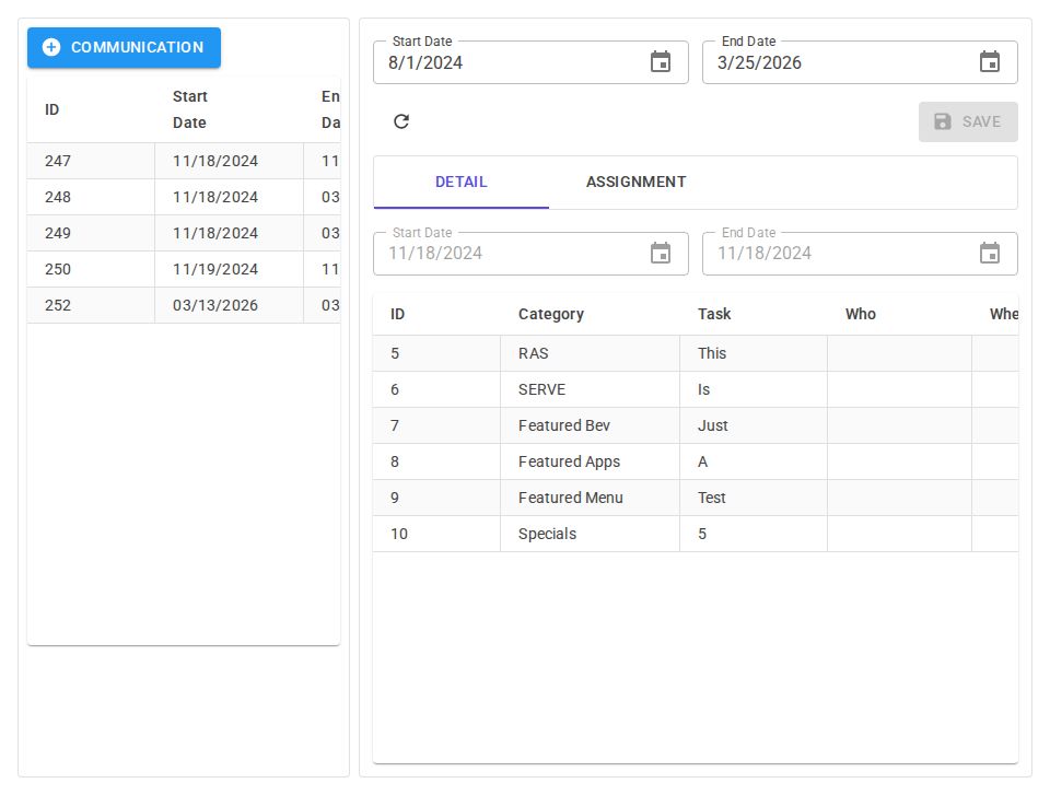
PreShift Communication View
By Richard Beverly
mudblazor
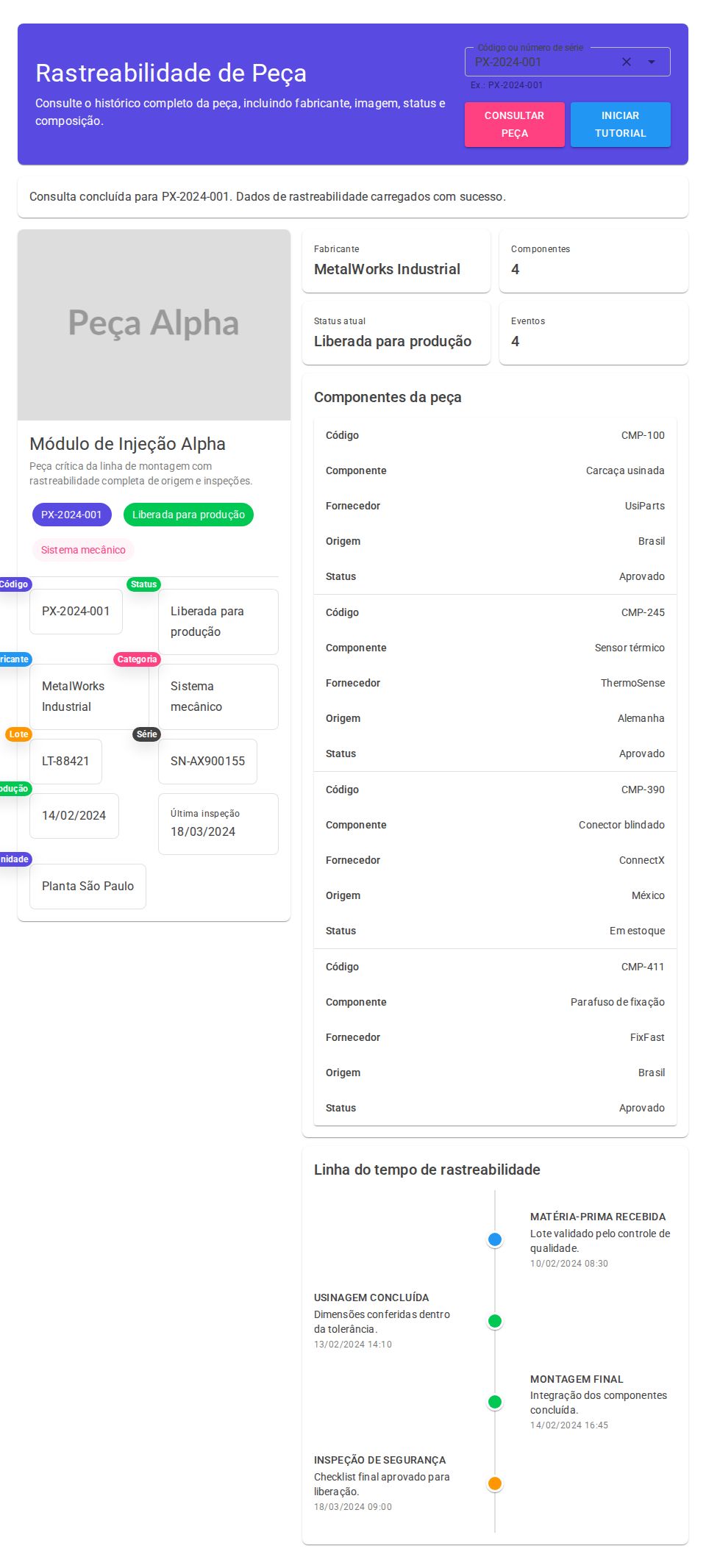
Part Traceability Screen
By Ryan Gaspri
MudBlazor
MudBlazor File Review
By Jefferson Carvalho
MudBlazor
Bootstrap
Blazor UI Design
By AJESH DARJI
Bootstrap