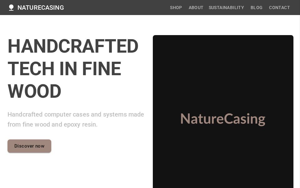
M
Marco Homuth

Custom Wooden PC Cases Landing

MudBlazor Landing Page presenting a dark-themed e-commerce showroom built with MudGrid product tiles and MudCard components, a MudAppBar and responsive MudDrawer navigation.

LIVE DEMO
Generated using Instruct UI - An AI for Blazor UI Generation
## What's implemented - Hero section with title, subtitle, CTA button and a large MudImage. - Responsive product gallery using MudGrid and MudCard tiles with image, description and price. - Top navigation bar (MudAppBar) with desktop links and a mobile MudDrawer menu. - Newsletter input (MudTextField with adornment) and social icon buttons (MudIconButton). - Simple client-side state: in-memory product list initialized in OnInitialized and drawer open state bound with @bind-Open. ## Key components - MudLayout, MudAppBar, MudDrawer, MudMainContent - MudGrid, MudItem - MudCard, MudCardMedia, MudCardContent, MudCardActions - MudImage, MudText, MudButton - MudStack, MudTextField, MudIconButton - ProductViewModel (simple view model populated in OnInitialized) ## How it works - Products are stored in a private List<ProductViewModel> and populated in OnInitialized; UI renders via a foreach loop and MudGrid/MudItem breakpoints. - Drawer open state uses @bind-Open and a private bool (_drawerOpen) toggled from the MudIconButton in the AppBar. - CTA and product buttons are present but not wired to navigation or services; newsletter field uses MudTextField with an adornment acting as a subscribe control (no handler). - Layout relies on MudBlazor components for responsive behavior; grid breakpoints (xs/sm/md) control card stacking. ## Styling - Custom CSS (app.css) provides a dark theme and custom classes: .transparent-appbar, .btn-custom-brown, .dark-card, .text-light-beige, .newsletter-input and overrides for mud drawer background. - The markup includes utility-style classes (e.g. mt-16, rounded-lg, d-none d-md-flex) that mix MudBlazor defaults with utility-like responsiveness. - Images use MudImage with object-fit and fixed heights for predictable layout; cards include hover transform and shadow in CSS. ## Reuse steps 1. Add MudBlazor to the project (NuGet) and register services (e.g. builder.Services.AddMudServices()) and static CSS in index.html/_Host. 2. Import MudBlazor in the component: @using MudBlazor and ensure _Imports.razor includes MudBlazor if preferred. 3. Copy the Razor markup and ProductViewModel, and include the custom CSS rules (app.css) or merge into site stylesheet. 4. Replace placeholder images and the in-memory _products list with a product service or API; implement navigation to a product detail page. 5. Wire newsletter input and action handlers, and add accessibility attributes and ARIA labels for buttons and images. ## Limitations & next steps - This is a single-page UI scaffold generated by Instruct UI: product data is local and placeholder images are used. - No backend integration, cart, routing for product pages, or newsletter submission endpoint is implemented. - Buttons (View Product, Discover now, Subscribe) lack click handlers and navigation; authentication/checkout not present. - Next steps: connect an API/service for products, implement routing and product details, add shopping cart state, and add tests and accessibility checks.